Career Exploration App
Client
Jebbee
Year
2021-2023
Timeline
Ongoing
Tools
Figma, Whimsical
Our client was dedicated to helping students and career seekers discover meaningful career paths by offering tools and real-world video resources. They came to us with an existing product, seeking our expertise to refine the user experience and enhance the design.
Initial UX/UI Audit & Recommendations
The project began with the client providing their current app screens. We conducted a comprehensive UX/UI audit, identifying areas for improvement and providing actionable recommendations. Our insights were informed by best practices and examples from leading apps like Nike, TikTok, and Yelp, ensuring that the suggestions were both innovative and user-friendly.
We incorporated the client’s initial user feedback and research into our recommendations, ensuring our work aligned with the needs and expectations of their target audience.
Structuring the Experience
To lay a solid foundation for the app’s functionality, we:
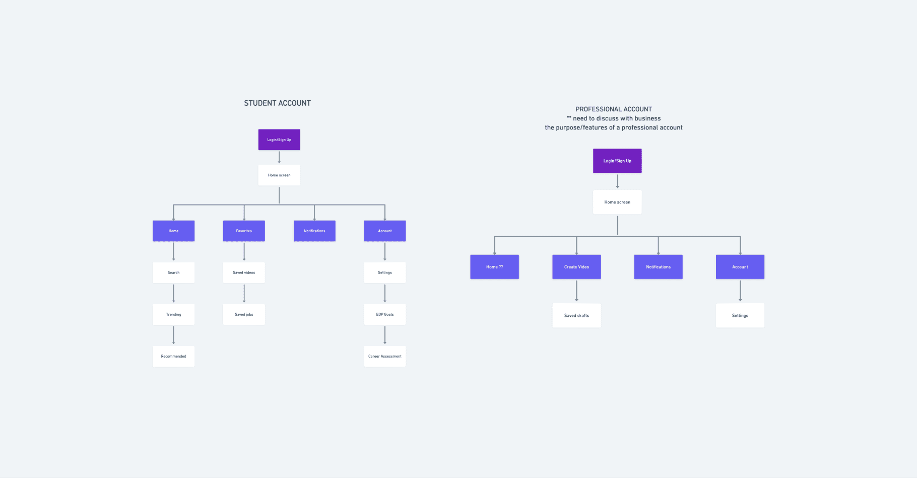
Created Site Maps: Designed site maps for both student and professional accounts, ensuring clear navigation paths tailored to each user type.
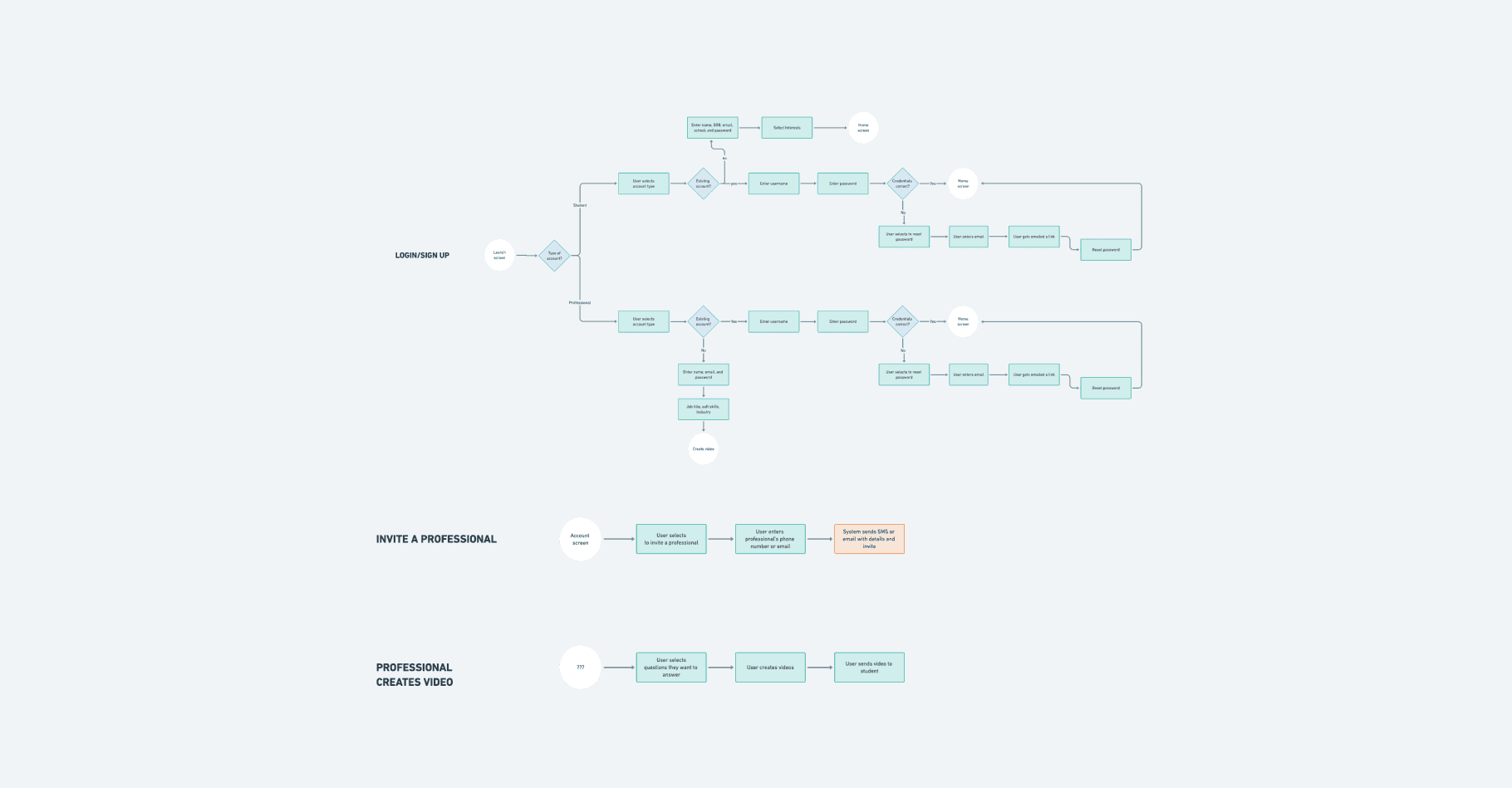
Developed User Flows: Mapped out user flows for critical app features, including:
Sign-up and login processes.
Students inviting professionals to join the platform.
Professionals creating and uploading career-related videos.
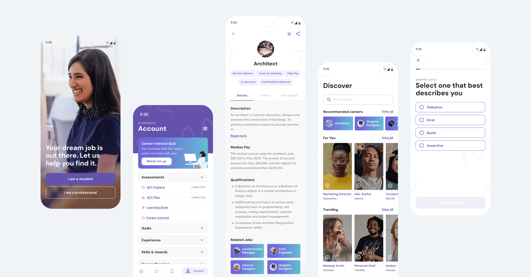
Wireframes & Content Strategy
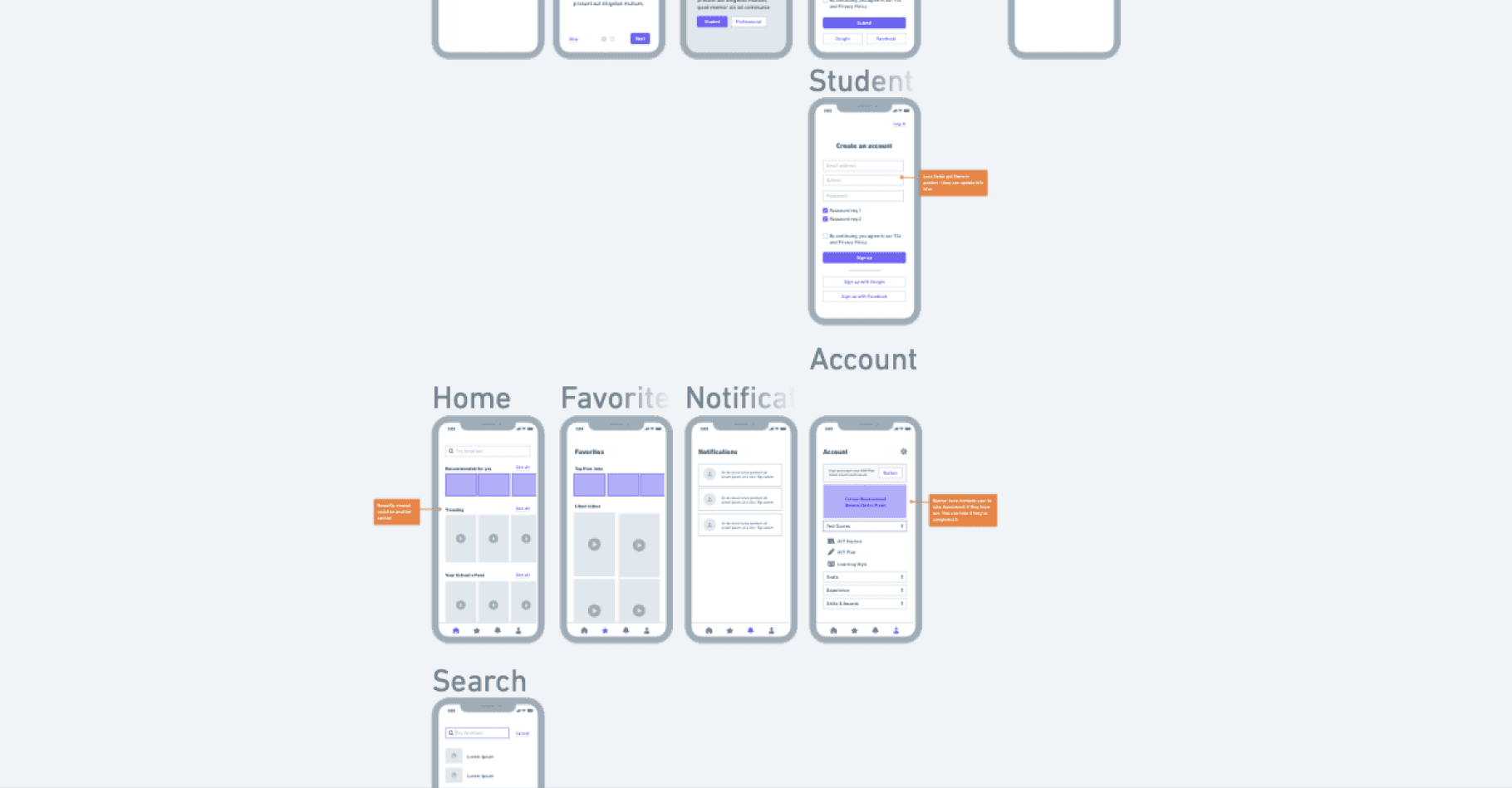
Next, we designed wireframes for key app screens. Each wireframe was accompanied by detailed documentation covering:
Content recommendations.
UX best practices.
Layout suggestions to enhance usability and engagement.
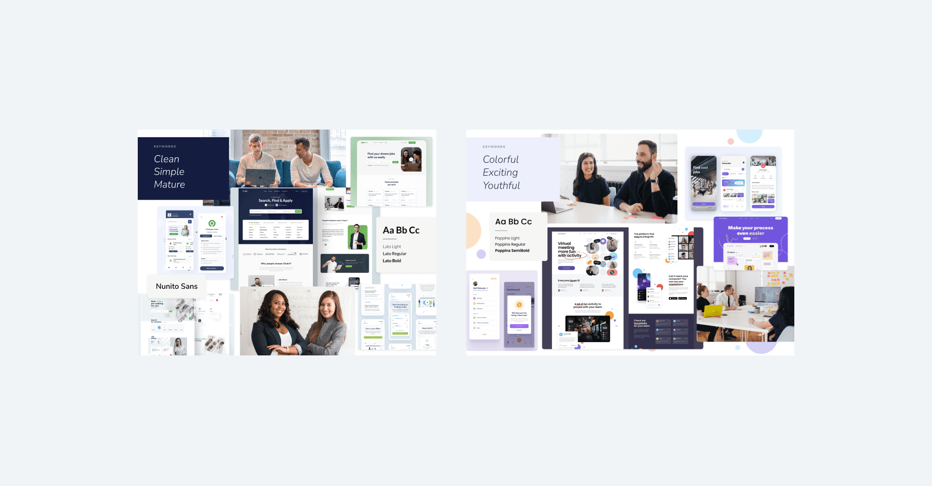
Establishing the Visual Direction
With the foundational structure in place, we shifted focus to the visual identity:
Mood Boards: Created two distinct mood boards, each reflecting different color schemes, imagery, and brand personalities. These mood boards were rooted in the client’s target audience preferences and research findings.
Style Guide: Using the approved mood board, we developed a comprehensive style guide that included:
Recommended color palettes.
Typography guidelines.
Vector accents to add personality and delight to the design.
High-Fidelity Screens: Designed five high-fidelity key screens that brought the style guide to life and served as a blueprint for the client’s team.
Ongoing Collaboration & Iteration
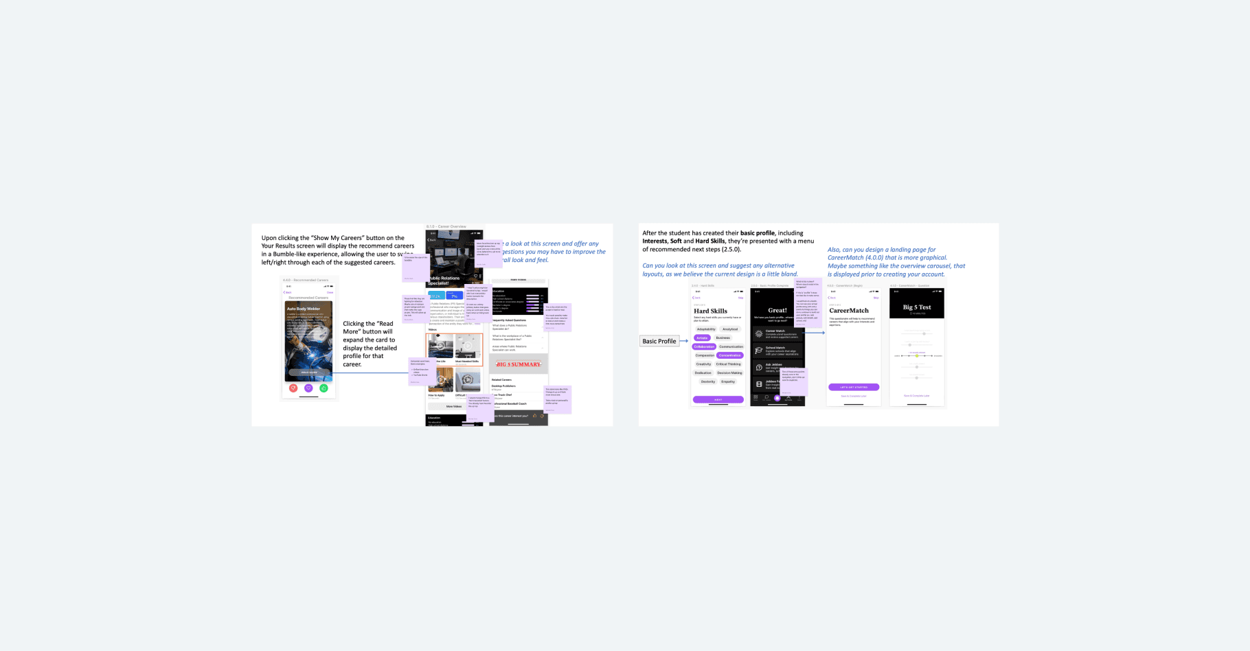
About six months after delivering the initial designs, the client returned with new screens created by their internal team. We conducted a simpler second UX/UI audit, providing recommendations and raising concerns. These insights were implemented into their designs and workflows, ensuring a continuous improvement cycle.
Another six months later, the client engaged us again to conduct a third UX/UI audit. This time, our focus was on key screens and specific flows where their team faced challenges or required expert guidance.
Outcome
Through our partnership, the client:
Gained a robust, user-friendly foundation for their app.
Improved user flows and experiences for both students and professionals.
Established a cohesive visual identity that resonated with their target audience.
Successfully iterated on their designs, leveraging our audits and recommendations to address usability issues and enhance functionality.
This project exemplifies how ongoing collaboration and a user-centered approach can drive impactful results. By integrating strategy, creativity, and expertise, we helped our client empower their users and achieve their goals.